Hack into your friends WhatsApp account & read all his/her chats


We have already seen how cellphone spy apps can be used to spy on anybody’s WhatsApp account and it can be the best solution to keep a watch on your Child’s WhatsApp conversations along with other activities that your child indulges into using his/her cellphone.
The only downside of the spy app is that you need to install the app on your target cellphone and for this you will definitely need to have access to the target cellphone for a longer period of time and also rights to install the app (Sometimes rooted Smartphone or jailbroken iPhone). In short it consumes a lot of time.
What if i told you, there is an easy way out to quickly check out what your kid or friend has been doing with his WhatsApp account?
Let me show you the simplest and the most quickest way for hacking into anybody’s WhatsApp account for free and that too with just few seconds.
Yes! you just need to access target phone for few seconds and you are ready to hijack his/her WhatsApp account.
* ] This Trick may sound dumb to you and you are probably aware of the feature that we are abusing.
As you know WhatsApp has a web app called “WhatsApp Web”, which by default can be accessed only through a desktop computer. So all we are doing here is abuse “WhatsApp Web” service using your cellphone.
Here is how you can quickly read your friends WhatsApp conversations:
Step 1
On your cellphone open Chrome browser and visit web.whatsapp.com, You will be taken directly to whatsapp.com. Now Goto chromes menu and check “Request desktop site”, to be able to access WhatsApp web service.
Quickest way to hack whatsapp step 1
Step 2
Once you request for desktop site, chrome will automatically ace the desktop version of web.whatsapp.com, which is a service to access your WhatsApp account on your desktop. You will see a QR code this page as shown below. Just zoom the page and keep it ready.
scan the qr code to hack whatsapp step 2
Step 3
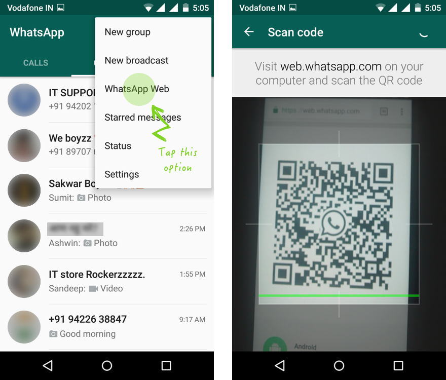
Now quickly grab your friends cellphone, Open WhatsApp messenger, Tap on the menu icon and Click “WhatsApp Web” option. You will be asked to Scan the QR code, quickly scan the QR code that your created on your cellphone.
hack whatsapp in seconds step 3
Step 4
As soon as you scan the QR code, all of your friends WhatsApp conversations will be accessible from your cellphone as shown below.
view hacked whatsapp conversations step 4
You will be able to read chats, reply to people or delete chats as long as your friends cellphone is connected to the internet. As soon as your friend disconnects from internet, you will be automatically logged off from WhatsApp web.
To avoid this, just disconnect your cellphone from the internet after opening or reading 2 to 3 conversations, This will stop WhatsApp from checking the connectivity and allowing you to keep reading all the conversations that are already loaded.
#contents hacker9, hackmaster, khanztechnologies, www.khanztechnologies.com

New Phishing Strategy to Steal Your Crypto-currency – Nasty Chrome Extensions


Chrome extensions are small software programs that let you customize the browsing experience and build powerful tools that help solve problems right inside your web browser. In contrast, they are nothing but web pages built on web technologies such as HTML, JavaScript, and CSS.
Any tool that is powerful enough to do good, can be misused as well. Here come the malicious chrome extensions.
Did you know you can build a chrome extension that can modify a website’s HTML or CSS, Steal passwords, Steal CPU power? Yes, Malicious chrome extensions can do all sorts of evil things including phishing.
Such nasty Chrome extensions have been around since a long time, stealing critical user data and engaging victims in click fraud.
However, according to the recent hack of Hola VPN service, wherein hackers compromised their free VPN chrome extension and tricked myetherwallet.com users into giving up their login details, It is evident that Hackers are now using chrome extension to Phish cryptocurrency wallet credentials or private keys of users using online wallet services.
Popular cryptocurrency wallet providers like myetherwallet.com make it easy for you to access your wallet on the web using a wallet password like Private Keys, Keystore Files, and Memnomic Phrases. Certainly, this is a very powerful feature, but also potentially dangerous, because each user is responsible for the secrecy of their own passwords or Memnomic Phrases.
If a hacker can trick you into sharing those Memnomic Phrases, they can steal everything from your accounts. And since there is too much room for end-user error, It is always recommended to use either hardware-based wallets or beware of all the possible ways you could get pwned.

New Phishing Strategy – Compromised chrome extensions

In recent times, Hackers have stolen between $152,000 and $365,000 worth of Ether coins from users of the popular cryptocurrency wallet provider, myetherwallet.com by redirecting them to a phishing website. The hackers were able to break into the DNS server at an ISP, replace genuine website address to a phishing site and carry out mass phishing attack on those users.
Another common phishing technique used by hackers to steal cryptocurrency wallet keys involves spreading fake token sale or airdrop programmes across social media sites which redirect users to a legitimate-looking phishing site.
As if this was not enough, Hackers are now phishing cryptocurrency wallet users by compromising popular extensions that are being normally used by such users.
New Phishing strategy to Steal Cryptocurrency
For example, Look at Hola VPN Hack. Hackers were well aware of the fact that most crypto users use VPN to maintain anonymity. All they did was, compromise Hola VPN’s Google Chrome Store account and upload a modified version of the extension to the store. Any new potential user who looked up for free VPN extension unknowingly installed this dummy extension.
Now imagine, What if these crooks build a nice useful chrome extension that is specifically made for the crypto world, Like a tool that quickly lets you check cryptocurrency prices or maybe some other crypto related deets.
With this, they also bind evil code that will inject javascript to perpetrate phishing attacks. All they have have to do is advertise or push this chrome extension to potential crypto users.
Phishing attacks are perpetrated through a variety of channels, and hackers are only getting more sophisticated day by day.

How Javascript injection with chrome extension works?

The essence of Javascript Injection is to inject the Javascript code, that will be run from the client-side i.e on the users web-browser.
With JS Injection a malicious user can modify or change the displayed website‘s information, insert new website elements like a pop-up screen, or manipulate the parameters like cookies bringing some serious website damages, information leakage and even hack.
Primarily, JS Injection is perpetrated through various website’s element like forum posting, article‘s comments fields or any other forms where text can be inserted. Nevertheless, it can be also committed using chrome extensions.
Google Chrome extensions provide a way out to execute or run our own scripts into a web page via “Content-scripts”. Not only scripts but we can also inject our own stylesheet.
“Content-scripts” are JavaScript files that run in the context of a web page. “Content-scripts” can read and manipulate DOM (Document Object Model) of any web pages the browser visits.
Before we go ahead, make sure you know the basic anatomy of chrome extensions.
Take a look at the following “content_scripts” snippet:
"content_scripts": [
{ "run_at" :"document_end",
"matches": ["https://myetherwallet.com*"],
"js": ["jquery-2.2.4.min.js","script.js"],
"css":["css/custom.css"] }
]
Here, “jquery-2.2.4.min.js”, “script.js” & “custom.css” are the files we have defined as “Content-scripts”.
The “run_at” tells the extension when to execute our script with options of “document_start”, “document_end” and “document_idle”.
This particular Content-script will inject the scripts we mentioned as soon as the web-page URL matches with that of https://myetherwallet.com. Otherwise one can also make the script work in more than one or all pages and tabs.
The Javascript file “script.js” contains snippets for HTML elements and corresponding style information is saved into a separate file called “custom.css”.
Upon execution of the above scripts, the extension will insert a new HTML element into the web-page. Essentially the HTML element being a Popup window that asks or tricks the user into sharing wallet details like private keys or recovery phrases.
The Injected scripts behave as if they were included by the page itself. Take a look at this popup impersonating active MetaMask session:
phishing wallet private keys and recovery phrases
The pop-up interface asks the user to enter their wallet seed words. This form then sends the seed words up to a private server, and presumably, the funds are drained from all of that user’s accounts.

How to protect my wallet against hackers?

The internet is a minefield, and traps can be set on any message you receive or site you visit. This guide advocate for best practices to prevent phishing attacks on your cryptocurrency wallet.
One of the easiest practice to keep your cryptocurrency safe is, of course, using a cold storage wallet or Hardware wallet. Get yourself a Ledger or TREZOR Hardware wallet that will cost you less than $100. However, if you do not wish to buy a cold storage wallet, follow these security tips below to keep your digital fortune safe.
  1.  Always Bookmark your crypto sites and use those bookmarks ever after.
  2.  Always log in to your crypto sites in an incognito mode of your Web browser, where code injection is not possible.
  3.  Never trust any social media message or URLs – Don’t ever fall for messages that say you can get free ETH. Always verify information with a secondary source.
  4.  If you do not wish to use incognito mode, Install EAL or Cryptonite to warn you if you go to a malicious website.
  5.  Don’t ignore SSL certificate warnings: Having simple SSL certificate (i.e just https) in the URL doesn’t make the website legitimate. Always look for “Extended Validation SSL encryption”. Sites using “Extended Validation SSL encryption”, generally have their company name that precedes https. It is a security feature put in place to verify that the website is actually served by the company it claims to be from.
@
www.khanztechnologies.com

The 5 rules of A/B testing


The 5 rules of A/B testing

If you are in an online business, most probably, you know what A/B testing is. (Sometimes it’s called split testing or bucket testing). And there is a big chance, that you have already done at least some headline or e-mail subject tests. Regardless you are an online marketer, web designer, product manager, data analyst or UX-expert you can easily set up and run A/B-tests all around your website and product. And this is cool. BUT!
Even if most people know A/B-testing, the majority of them are doing it wrong, because they are breaking some of these 5 simple rules! Go through on them and make sure you won’t do the same mistakes!

What A/B testing is? The basics.

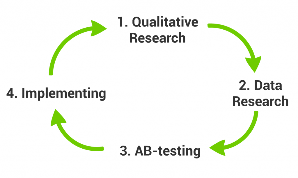
A good research project has 4 steps:
  1. Qualitative Research
  2. Data Research
  3. AB-testing
  4. Implementation
ux_data_splittest_repeat
Qualitative Research –» Data Research –» AB-test –» Implement –» Repeat
Qualitative Research helps you to identify the issue, Data Research helps you to validate the issue and eventually A/B-testing helps you to compare the different resolutions to each other. (I wrote about this in details here: Create a Good Data Research Plan!)
AB-testing is a research method, where you compare two different variations of your website to each other. You do this by a randomized experiment, where 50% of your visitors get the “A” version of your site, 50% get the “B” version of your site. You measure the conversion for each “A” and “B” groups. And the more successful variation wins.
A/B testing sign up button
Two different “Sign Up” buttons — ready to A/B testing
You can A/B test not only your website, but your ads, your e-mails, your e-mails’ subjects, your mobile app, your features, even your pricing… anything. And yes, you can have more than 2 variations (3, 4, even 10) in an experiment.
If you don’t know, Why A/B testing is needed at all? Read it here: Click.

Rule #1: The different versions should run at the same time!

Running version “A” in November, then running version “B” in December is NOT an A/B test! Why? Because of seasonality.
Imagine that you are an online book store, it’s very likely that by default you will have a higher-than-average conversion rate in December (because everyone buys Christmas presents in that month) and a lower-than-average conversion rate in January (because everybody got their books already at Christmas). If you test the colours of your “BUY” buttons during this period, like:
  • test blue during November,
  • test green during December,
  • test red during January,
you won’t be able to tell if the change was the effect of the actual colour-change or just the seasonality.
In a proper A/B test the different versions are running at the same time, in parallel with each other.

Rule #2: The test and the control group should be selected randomly!

I give you a classic “AB-testing” mistake example:
Ben (fictional character) works for a startup. He creates a new personalized newsletter for all the website visitors, who filled the optional fields (eg. gender, current city, education level) on the registration form. This group will be Ben’s “test group”. He compares this personalized newsletter to a general newsletter. The general newsletter will be sent for the rest of the audience, who didn’t fill the optional fields on the reg-form. They will be the “control group”. After running the campaign Ben sees that the personalized newsletter has a 3-times higher click-through-rate. Wow! Personalization is awesome, right?
Well. No. I mean, maybe. But the click-through-rate would have been higher for the test group anyway, because they are more committed visitors. We know this from the fact, that they gave us more data about themselves.
This was NOT an A/B test! This was something called selection bias.
To avoid these kind of issues, make sure that the test and the control groups are as homogeneous as they can be. To achieve this, you should have 2 things: a) random selection and b) big enough sample size.

Rule #3: Don’t let the Users know they are taking part in the experiment

Another kind of bias is the observer bias. I see time-to-time websites “AB-testing” with putting up two variation of their website to the front page, where as a visitor you can select, which one you want to see. And they make their conclusions by checking, which version people choose. This is NOT an A/B test, either!
ab_test-you_cant_alway_get_what_you_want
I’m pretty sure that Rolling Stones didn’t mean this to apply for user experience design, though it’s still valid for that too. Your users don’t know what they need. So if you ask them, you might get honest, but misleading answers. Don’t listen to what your users say. Listen to how your users act! You need to discover the perfect user experience by analyzing data and testing hypotheses, not by surveys. So don’t let users know, that they are in an A/B test.

Rule #4: Define measurable goals before the experiment and select one key-metric!

An experiment can’t run without a measurable goal.
Just set up and track multiple things! You can compare your different variations by engagement, click-through-rates, conversion rates, page views, time spent on page, etc. It’s always good to see all these metrics, because you can learn from them.
But when it comes to evaluate the experiment, you should have only one success metric. You will use this metric to make your decision. Eg. if conversion rate is higher for version A, than B, then version A won. If B is higher, than version B won. Simple as that.
metric_learn_successmetric_decide
Select one success metric!
This success metric should be selected before you start your test. The easiest way to lie to yourself with data, if you set up 10 different goals for an A/B test, then after the experiment you pick only the numbers, that are proving your hypothesis and ignore those, that are not. You can easily prevent it, if you select your most important metric beforehand and you strictly use that number for the evaluation.

Rule #5: Before evaluation look at significance level!

If you are using Optimizely (which is by the way my preferred “A/B-testing as a Service” tool as well), you can see the results as something like this:
optimizely_significance-level
Optimizely + A/B testing (significance level)
Unfortunately 4 out of 5 Optimizely users (that’s what I’ve experienced) are evaluating these results as a success. But it is not! Yet at least. Before you look at your conversion rate, always look at significance level first! If your significance is under 1%, then it doesn’t really matter that you have 30% uplift on your “B” version. You need to wait for more data to come in, because most probably you just had a lucky day.
optimizely_significance_level2
Check the significance level first! (right bottom corner)
If you flip a coin 10 times, it can happen, that you will have 9 heads and 1 tails. But it doesn’t mean that the probability of getting head is 90% and tail is 10%. It only means, that your sample size is too low. If you flip the coin 1000 times, you will have a higher chance to have something around 50-50%.
The same thing happens at A/B testing. You need to wait for a significant sample size to have conclusive results and a great decision.
How big is the optimal sample size? How to measure significance easily? Find in this earlier article of mine: Significant or not? Measure the efficiency of your A/B test!

+1 Rule #6: Change one thing at a time!

Well, this is not necessarily a real rule. But one’s for sure: if you change one thing at a time, it will be much easier to identify the reason of the conversion rate increase. On the other hand sometimes changing only one thing can slow you down. There are cases, where you need more radical changes, than just simply fine-tuning your headline message. In these cases you can take the risk of changing everything (layout, colors, messages). This risk has two components:
A) Maybe your new version is gonna be too radical and even if you put a lot of work into that, it will bring worse results, than the original version. Then it was sort of waste of your time.
B) Your new version performs better, but you won’t be able to understand, that which exact changes brought the great result.
Either way, if you have great analysts and UX people on your team, they can minimize the risk of A) and the risk of B) as well – by analyzing and understanding the different versions using other methods, than A/B testing (eg. UX researches, data analysis, heat mapping, predictive analytics, 5-sec tests, etc.).
So I’d say, don’t be afraid to change more than one thing, if it’s needed. But if you have the luxury of time and you just want to fine-tune things step-by-step, then I suggest to change things one-by-one.

Conclusion

A/B testing is a great tool and it’s even better if you are doing it right! 😉 So please keep these 5+1 rules and if you know someone who doesn’t, let him/her know, what to change!

Original Article rights : 
Written by Tomi Mester on December 16, 2016  checked and researched by Kalim Khan (khanztuto).(khanzdevelopers) For educational and research purposes only. Funkada is doing free website audit/analysis and working on research and implementation of CRO in Malaysia. 

CONVERSIONS TECHNIQUE IN 2019


5 CONVERSIONS TECHNIQUE IN 2017

In the last couple of years, conversion optimization among SEO practices is no doubt the most highly prioritized metric for web masters. After all, all marketing effort should lead to REVENUE. However, more and more practitioners are beginning to realize that focusing only on particular details you are strong at is very limiting to good ranking, ultimately a good conversion rate. That is why more and more marketing experts are preaching about offering a comfortable web browsing experience for customers. Nothing new, but people are starting to grind upon the concept.
We are not here to share the technicalities, benchmarks, data and bore you with numbers. In fact, we are going to point you to the obvious, but often neglected web practices. What you will find below is five of the more important optimization techniques that could be applied generally across all business, regardless of industries.
1.Optimize Across All Touch points.
Imagine touch points as your vital marketing channels between your business and your customers. They visit your website, they read your email newsletters, they meet you in exhibition, they receive your latest promotional prompts… You have to make an effort to keep these consistent across all platforms, and keep to your promises. Align your messages and keep them realistic for your customers, and for yourself.
2. Start Looking into data, and make use of them. 
As online marketers ourselves, we could generate pages upon pages of data for clients. However, these numbers mean nothing to us. You as your business owner, can only make the best out of these numbers, graphs and charts. Make decisions from your data.
3. Don’t rely on one landing page.
You don’t just sell one product, so why attract customers to one single point of interaction. Different customers will have different persuasion points, offer your products to different segments. Or maybe, you are serving a multi cultural customer base, and the proper thing to do is to lead them to different landing pages of their language and messaging.
4. Keep Your Contact Us Form Simple
We are still living in a rather sensitive digital age. Not all individuals are comfortable with information sharing. If you operate on any kind of online business, you will need to collect some form of data to make contacts with potential clients. The best thing you could do is to keep your forms short and simple. Really all you need is just simple contact details, dont complicate your customers.
5. Reduce Distractions
Don’t try to sell everything in one page, or don’t try to bombard customers with discount pop ups and emails, or don’t try to push tons & tons of product demos, case studies… These are distractions. Most businesses do this, thinking that the more information the more convincing your website is. The fact is, the more distractions you offer, the easier your visitors turn back.

Other CRO features to explore


Continuation of CRO research some of the contents are taken from What is CRO?  and checked and researched by Kalim Khan (khanztuto). For educational and research purposes only. Funkada is doing free website audit/analysis and working on research and implementation of CRO in Malaysia.